Designing a new navigation + landing pages _
for an e-commerce with 10M visitors/month.
Designing a new navigation + landing pages for an e-commerce with 10M visitors/
month.
INTERACTION DESIGN
This year, one of Stylight's main focuses is returning users and for those, the homepage is a vital part of their journey: a place where to come back, find inspiration, and discover new arrivals and trends. This requires the creation of a dynamic homepage that combines the best of our editorial inspiration with shoppable content suggestions to offer our users a more tailored experience.
As soon as we started to redesign the experience of the organic new comers, we realized that there was another part of the page that was also going to have a very important role in this new approach: the header navigation.
This is why we decided to work on both tickets together. I will explain in detail the main pain points that we had to tackle and how we solved them.
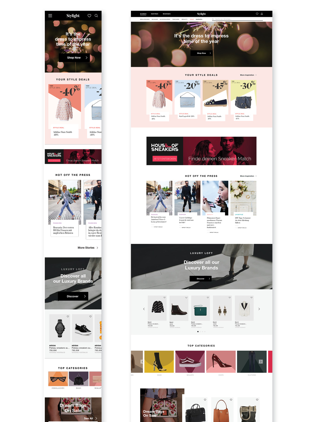
From a static editorial homepage to a user -tailored journey.
From a static editorial homepage to a user -tailored journey.
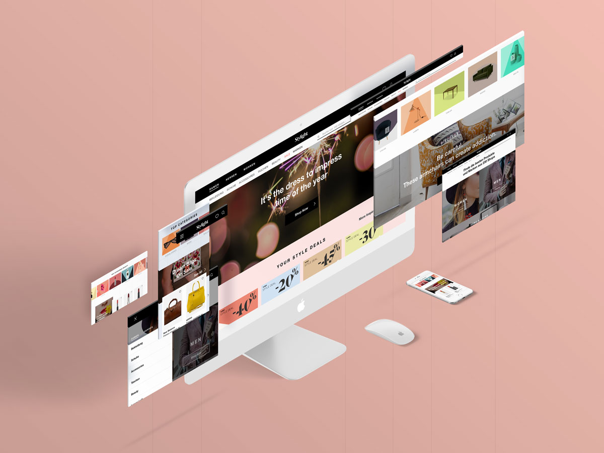
Old homepage and navigation (left) and new one (right).
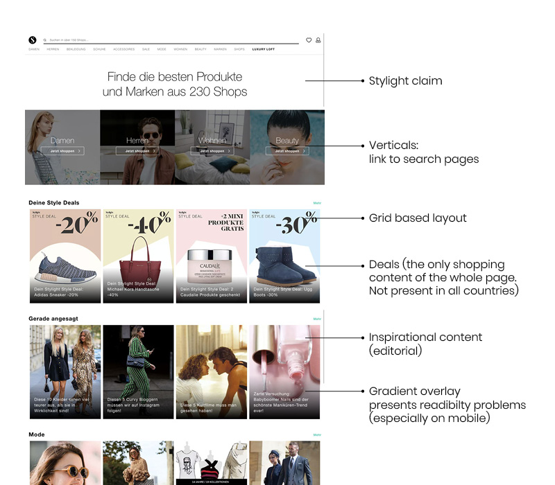
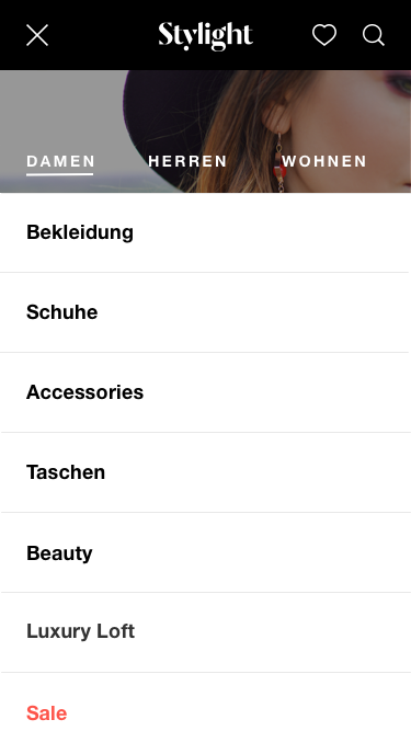
WHAT WAS THE STATUS QUO?
#1
The header navigation is confusing.
#1
The header navigation is confusing.
We had got this feedback several times from previous user testings. The main pain points were:
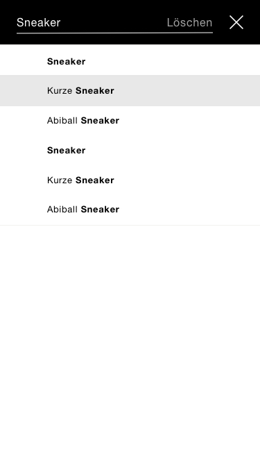
1. The search bar has too much prominence and the category navigation goes unnoticed.
2. There is a lack of hierarchy between the elements: all is shown at the same level (gender split + categories + verticals + brands + shops).
3. The navigation changes accordingly to the vertical the user is in. So, if the user is in a fashion search page, the navigation is Gender Split + Fashion Categories + .... However, if the user is in a beauty search page, the navigation is Gender Split (showing beauty products) + Beauty Categories + ... . (See image below). The user does not understand this behaviour straight away, and feels stuck.
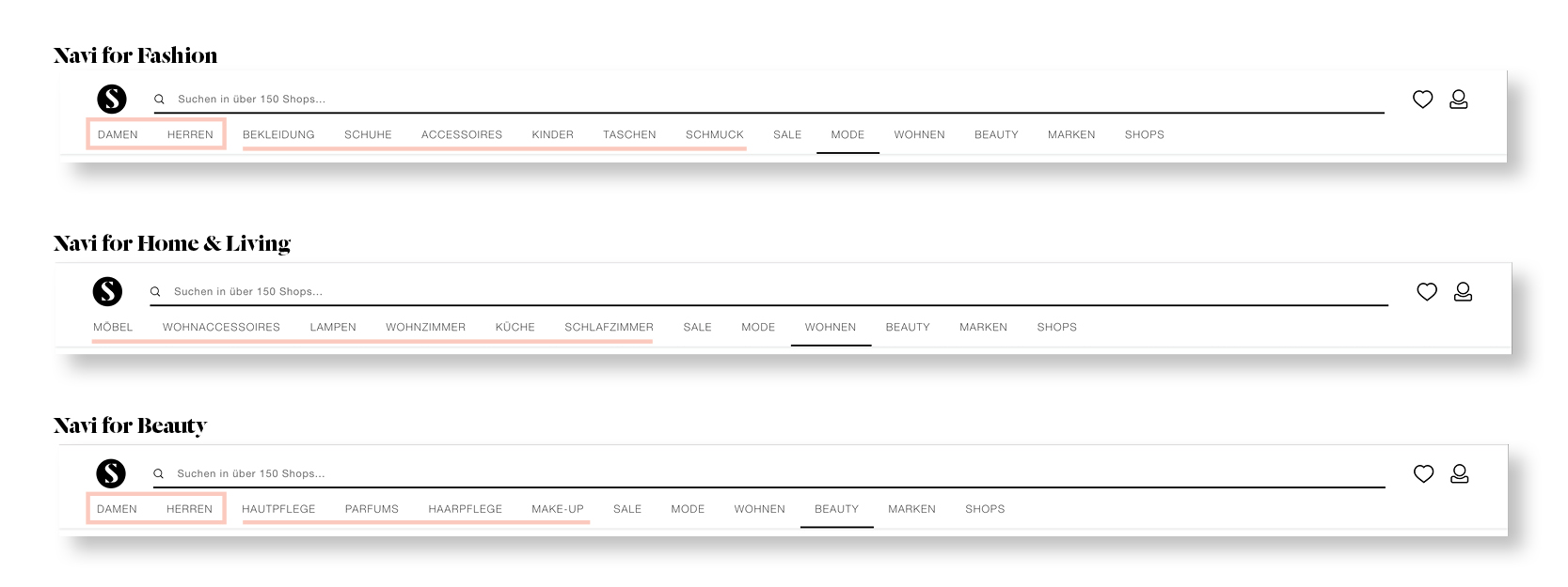
Different navigations according to the verticals (Fashion, Home & Living, Beauty)
Different navigations according to the verticals (Fashion, Home & Living, Beauty)
#2
The homepage lacks flow.
#2
The homepage lacks flow.
Regarding the homepage, we also wanted to tacke several painpoints, from the content side and the visual look and feel.
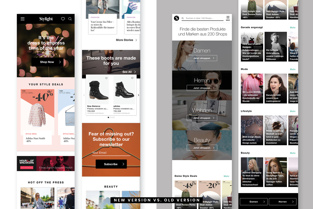
1. The layout is based on a blocky grid that displays almost only inspirational content (posts from our editorial magazine). From the design perspective, this makes the page feel very static. From the user perspective, we want to move away from this, and create a more dynamic layout that allows the incorporation of different components.
2. There is a lack of shoppable content, like for example, product suggestions that increase the user engagement.
3. We also want to bring more value to the user, through more personalized content.
The old version of the homepage and some of the main painpoints.
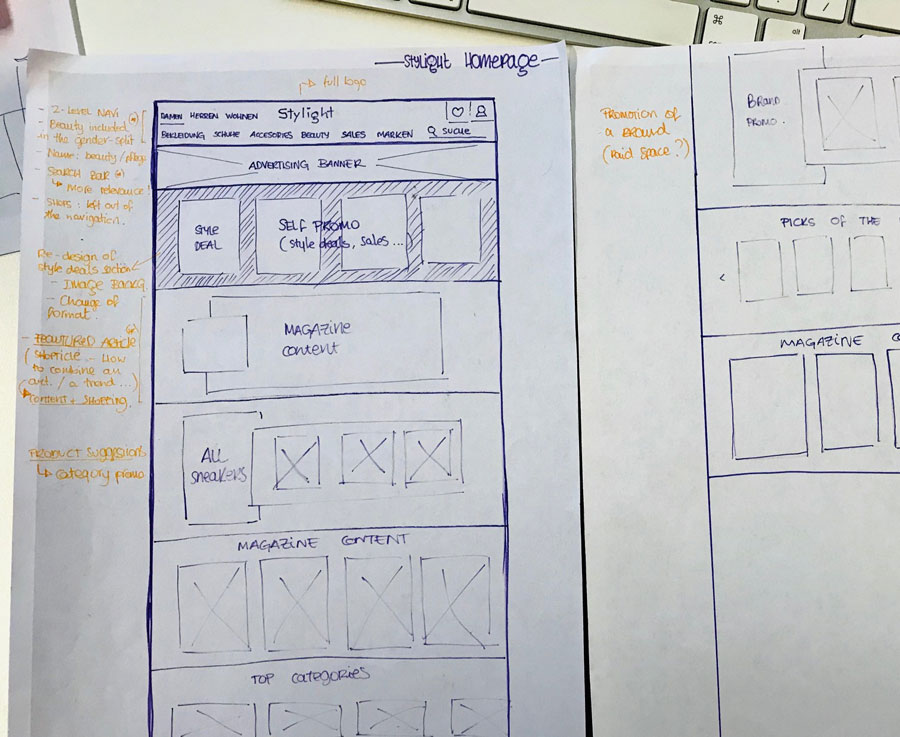
RESEARCH + EXPLORATION PHASE
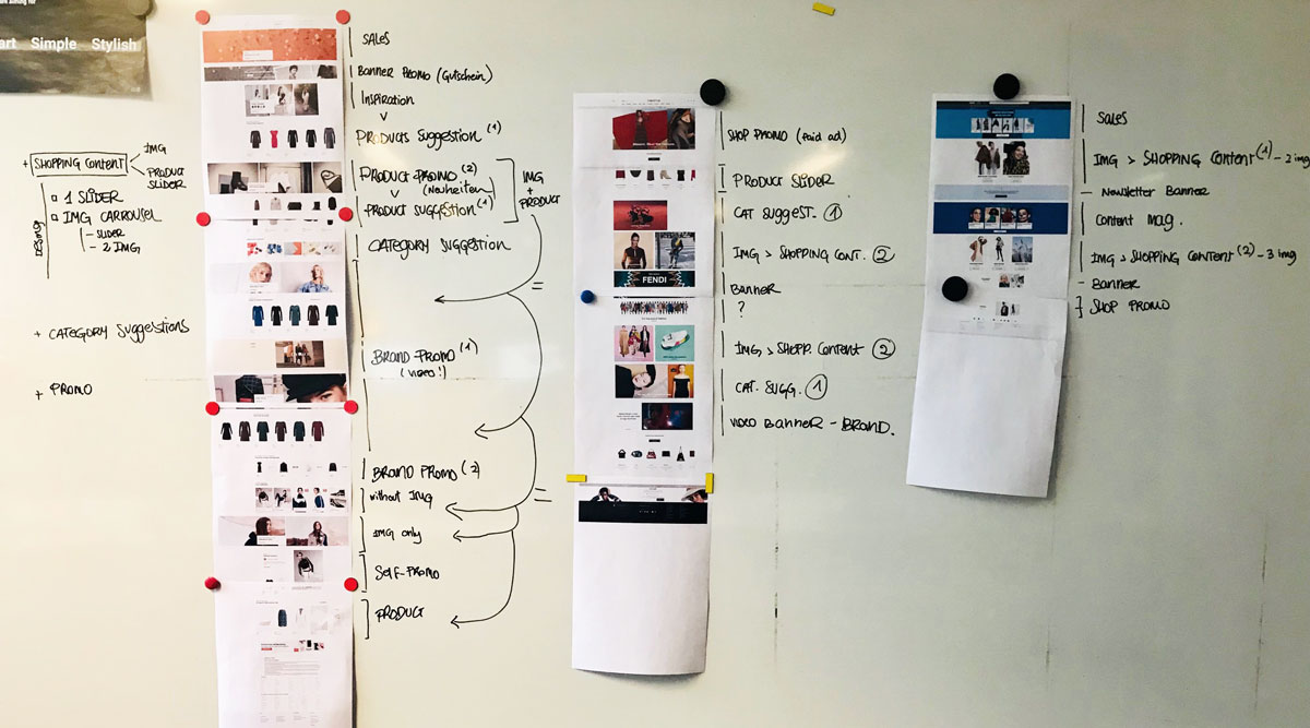
Research and analysis of the visual & content structure of the homepage of 3 main competitors.
We researched among the top players of the industry. In the end, we reduced the deeper analisys to 3 main ones: Zalando, Asos, & Farfetch. Even though part of my research was based on desktop, mobile was also taken into account, as 60% of our users come from this platform. We explored different possibilities sketching them on paper, and we discussed about the kind of content that could be valuable for the user.
During the whole process, it was important to align with other teams: advertising, business development & brand and content. We listened carefully to their needs, so we could make sure to benefit all ends.
It was key to design visual components that could be reusable, to uphold consistency and align with developers.
It was key to design visual components that could be reusable, to uphold consistency and align with developers.
NEW VERSION: HOW WE CREATED A NEW EXPERIENCE
New Navigation_
hierarchy & branding.
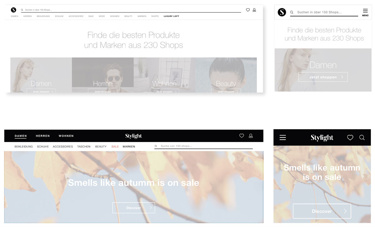
1. PAINT IT BLACK.
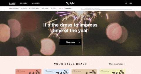
Yes, we decided to paint the navi black. Or at least the top half of it. Black is stylish, and one of the favourite colours of our fashion lovers. In a preference test, 90% of the users liked the black navigation better, over other white versions.
2. TWO LEVELS HIERARCHY (DESKTOP)
On desktop, the black visually helps to separate the hierarchy between the newly introduced 2-levels:
- Top level that is inmutable, reserved for the logo, the 3 main shopping audiences (Damen + Herren + Home & Living) and the user fields (wishlist and profile). It enables a first step in the direction of personalization.
- The second level is balancely divided between the main categories and the search bar. This way, category "Beauty" falls also under the gender split, as it makes sense from an organizational point of view.
3. MOBILE: KEEP IT SIMPLE
On mobile, the 2-levels hierarchy approach needs to be adapted, but we still decided to put focus on the brand, making the full logo a central element. Besides that, we moved the burger menu to the left, following a common pattern, and hid the search bar under one more click (the use of the pattern of showing just the icon is more than extended), in favour of adding a shortcut to the user wishlist.
And of course, the black still conveys this simplicty and elegance and easiness to use.
The navigation leads directly to search result pages, where the user can start filtering further.
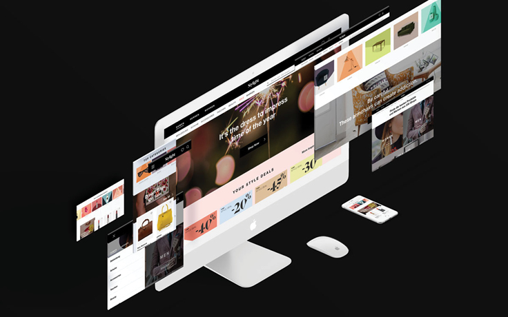
New homepage_
the start of a tailored journey.
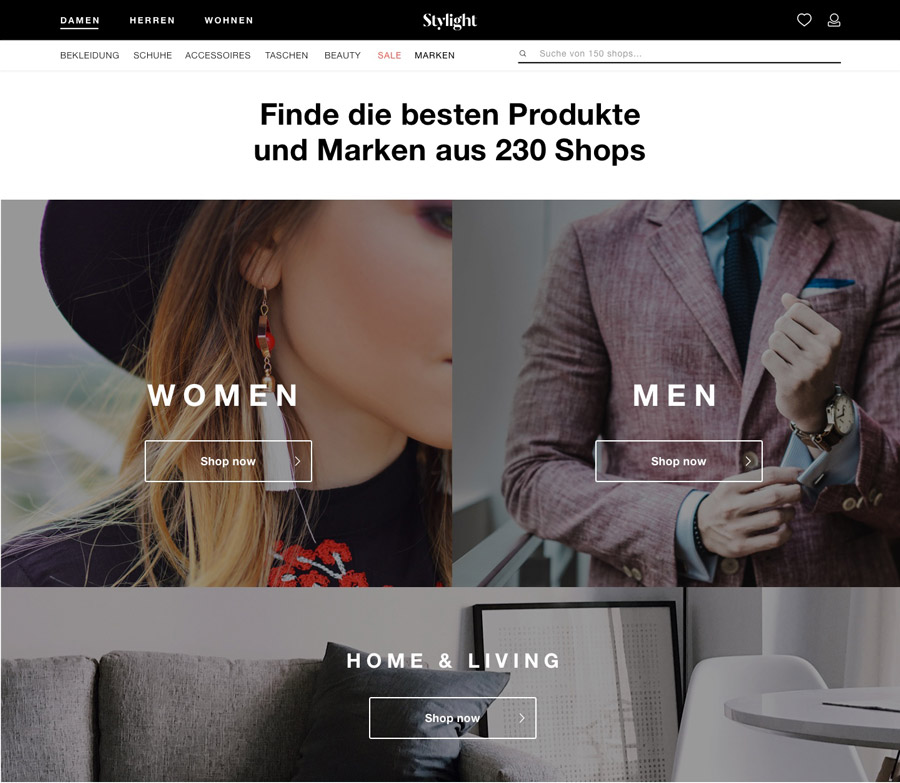
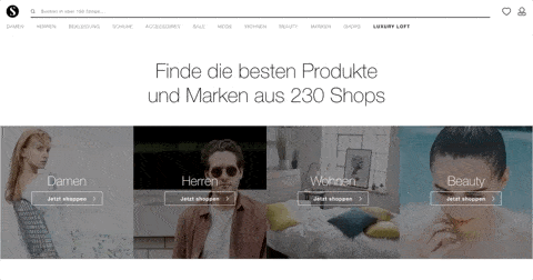
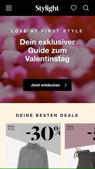
1. A GENERAL LANDING PAGE
As we want to be able to provide the user with what he/she is looking for, we first need to understand roughly what he/she might be interested in. That's why the first time a user comes to Stylight, there is this landing page waiting for them, which fulfills a double function: to communicate what we are ("Finde die besten Produkte und Marken aus 230 Shops") and to offer the choice among Women, Men or H&L.
Once the user has made the choice, then we are able to provide them with content and suggestions that are valuable:
2. TAILORED & CURATED PAGES FOR WOMEN, MEN AND HOME & LIVING
Once the user has made the choice, then we are able to provide them with content and suggestions that are valuable to start off their shopping journey:
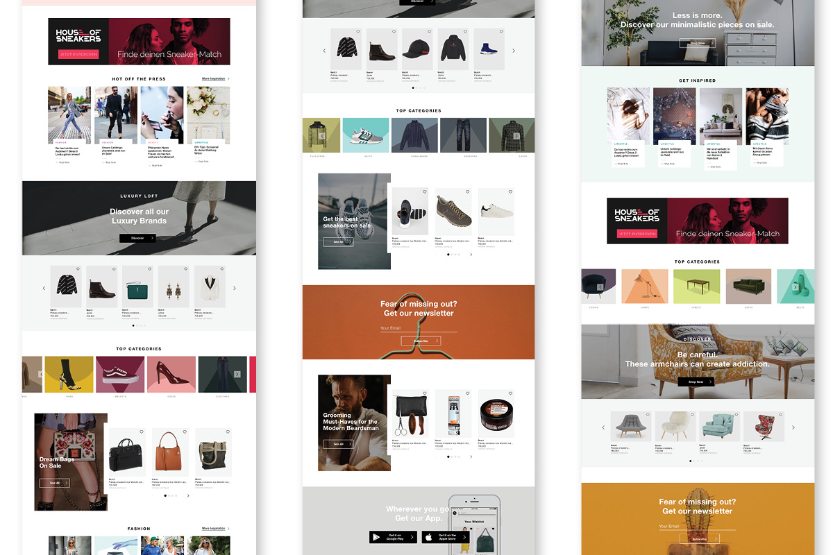
First mock up for tailored landing pages for Women (left), Men(center), and Home & Living(right).
We designed a new homepage based on reusable visual components that integrated editorial inspiration with shoppable suggestions.
We designed a new homepage based on reusable visual components that integrated editorial inspiration with shoppable suggestions.
The new landing pages are dynamic, in which the visual components fulfill different goals, from shopping content promotion to inspirational guidance. The redesign of the magazine preview on landing pages (headers in a black gradient overlay to a clean white label) seeks to come closer to the sleek editorial look as well as improve readability.
The new landing pages were AB tested, and quickly we noticed a reduction of the bounce rate, so it didn't take long to roll it out, first for Germany and US and shortly followed by the rest of the countries.
Stylight -
a new homepage to provide a new experience in the shopping journey.
Stylight -
a new homepage to provide a new experience in the shopping journey.
More projects
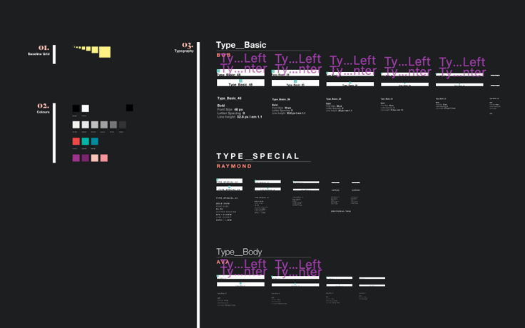
SketchesSketch I Typography
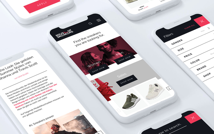
House of SneakersBranding I Interaction
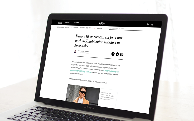
New navigation & homepageInteraction I Branding
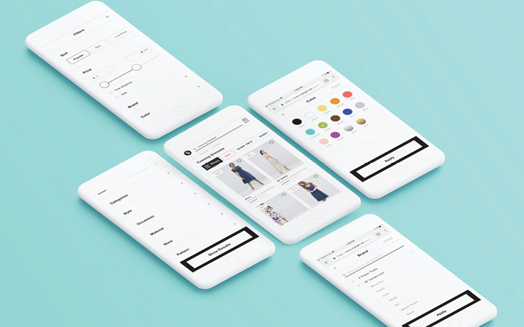
Filter UIInteraction I UI UX
Daho.am 2018Branding I Graphic Design I Interaction I Event
In Spirits BarBranding I Graphic Design I Interaction
Stylight BrandingBranding I Print I Graphic Design
Two Sides_ Posters of identityArt Direction I Photography I Self-iniciated
Packaging for a beauty setGraphic Design I Packaging
Design SystemUI UX
Magazine LayoutInteraction I UX UI
The MinionistasCampaign I Art Direction
70 years of CannesTypography I Poster
Stylight AwardsEvent Branding I Website
Daho.am 2017Branding I Graphic Design I Interaction I Event
Genius ClubBranding I Event
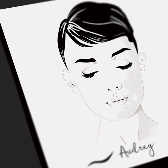
Gisele_ Her Life In CoversIllustration
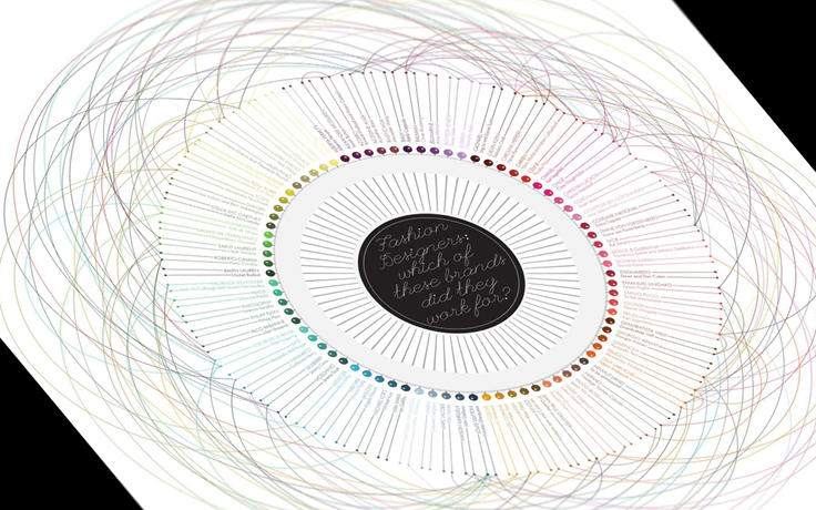
Fashion DesignersData Visualization
Iconic EyelinersIllustration
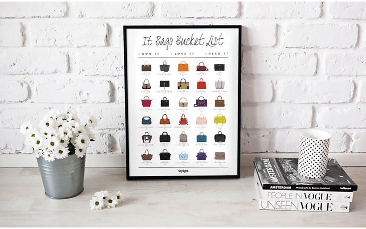
It Bags_ The bucket listIllustration I Poster Design
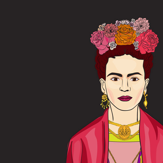
Frida KahloIllustration
Fashion Weeks_ Starter PacksIllustration I Campaign
FeedbackGraphic Design
360 Map_ Celebrities in CoachellaArt Direction I Interaction
Fashion Weeks In NumbersGraphic Design I Interaction
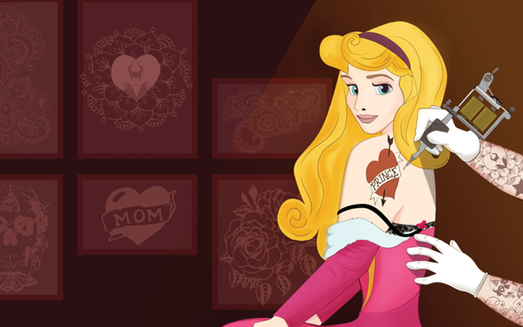
What do Disney Princesses do on Valentine's Day?Illustration I Campaign
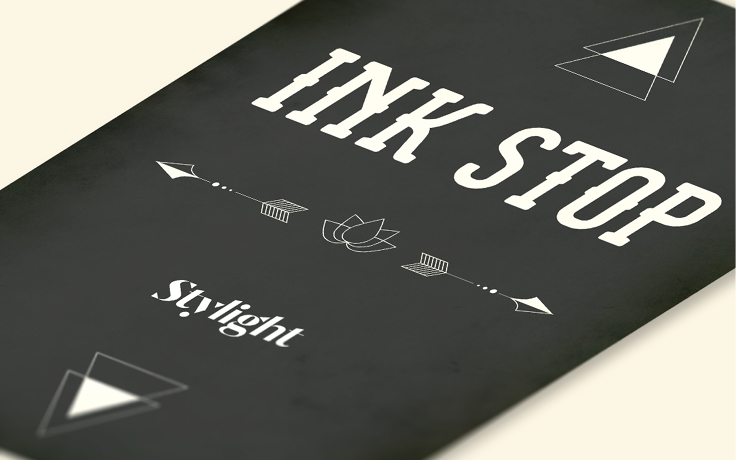
Ink StopBranding I Graphic Design
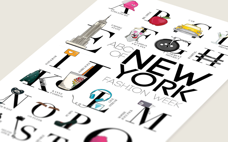
ABCs of Fashion WeeksGraphic Design I Interaction I Campaign
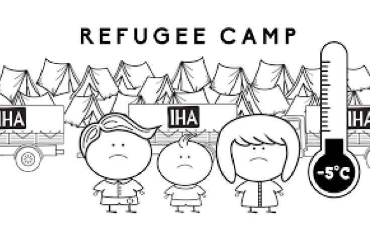
Intereuropean Human AidAnimation I Concept I Self iniciated
What is to grow upIllustration I Self-iniciated
Wall - DecorationArt Direction I Self-iniciated
21 things you can buy for the same price as an Apple watchCampaign I Icon Design I Infographic
Women of SeriesIllustration