Magazine Layout_
Redesign of a shopping inspirational magazine with 1 million readers/month.
Magazine Layout_
Redesign of a shopping inspirational magazine with 1 million readers/month.
INTERACTION
UI / UX
At Stylight, we want to give our users the style inspiration that will accompany them through their shopping journey. That's why our magazine has about 1 million readers / a month.
It was time for redesigning the old layout to give it a sleek touch and feel that would fit better to the brand, to introduce new components to cover the needs of the editorial team, and improve readability.
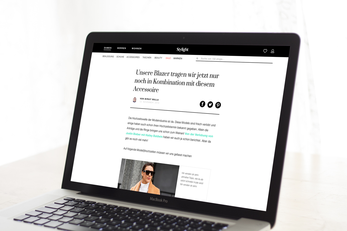
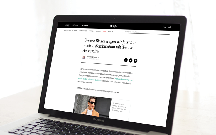
Old version of the magazine layout for desktop (left) in contrast to the new version for mobile and desktop (right).
The new magazine layout is more sleek, it improves readability, and introduces new components that cover the editorial needs.
The new magazine layout is more sleek, it improves readability, and introduces new components that cover the editorial needs.
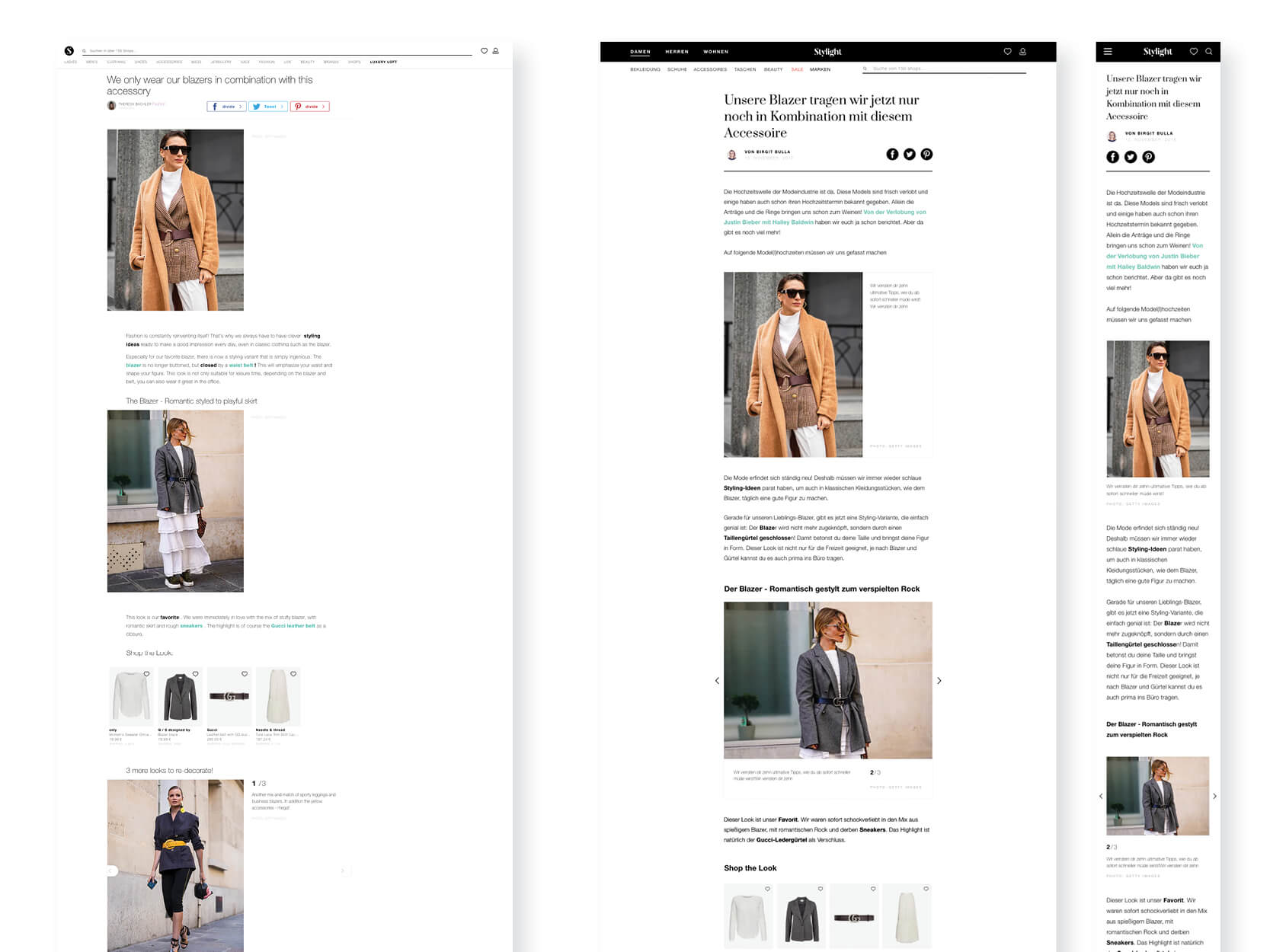
We decided to strogly focus on readbility, and therefore we followed the blog pattern for the design of this part of the website. SO we decreased the width of the content area and centering it completely when there is no banner on the side, increased line height of the body text, used the bold version of the font for titles, and introduced a serif contrastive font for the headline of the posts.
We designed some new components, for example: a new component to display square images in combination with text, or an element for infographics with a button to download. We also redesigned some old components:
Image Gallery. We reduced the area for the caption, agreeing on a maximum number of characters to accompany an image.
Shopable content preview:. We increased the image area, to highlight the product.
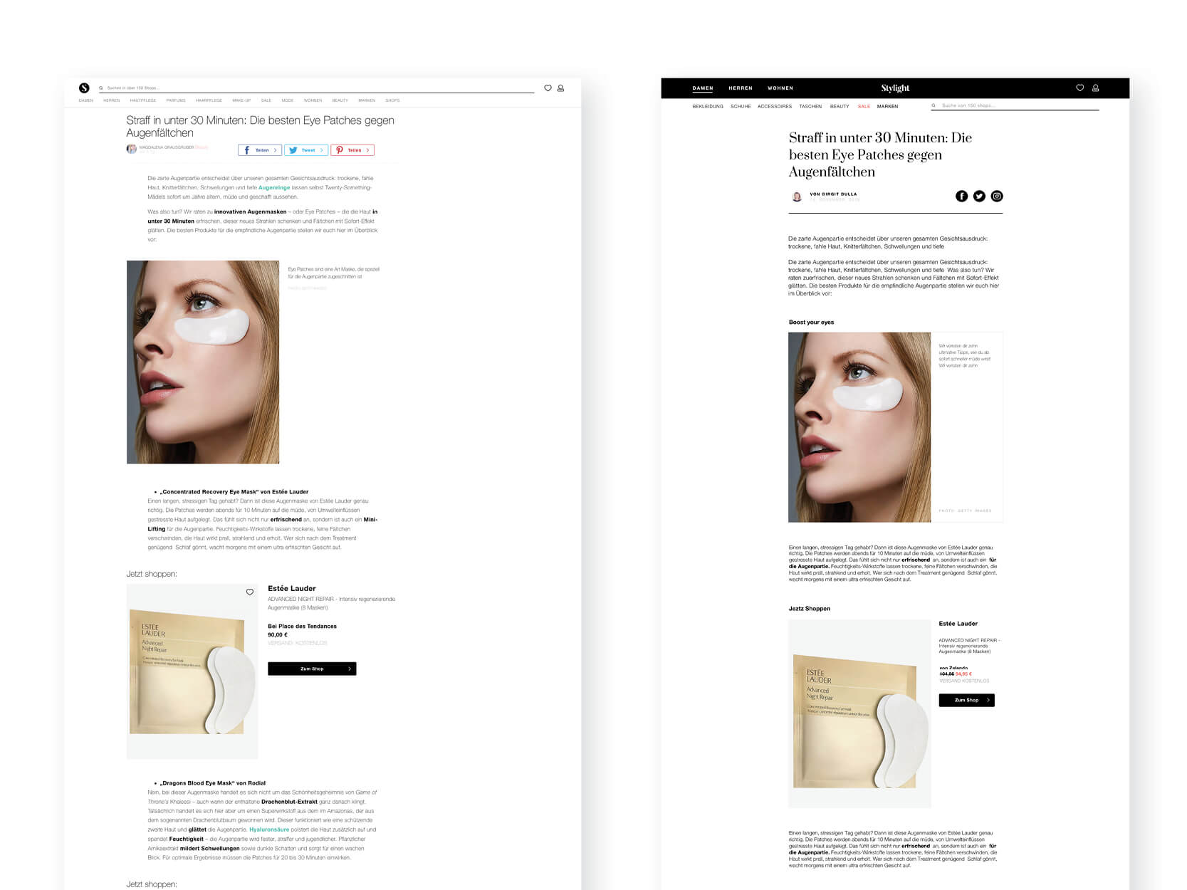
Old magazine post with shoppable content (left) and new version (right).
More projects
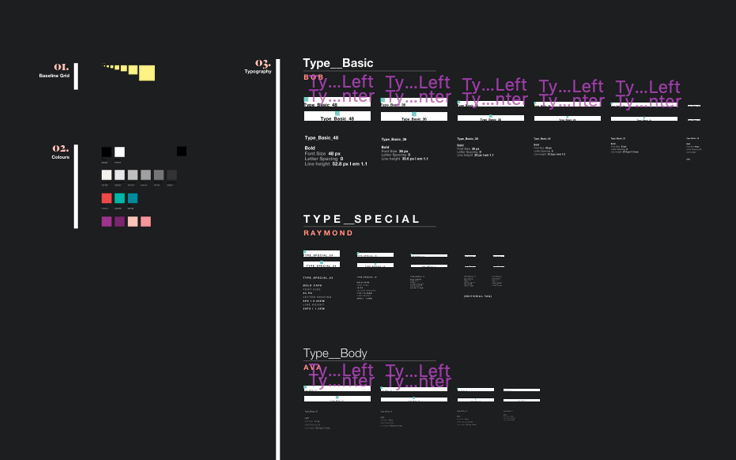
SketchesSketch I Typography
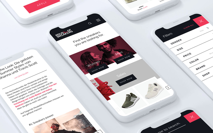
House of SneakersBranding I Interaction
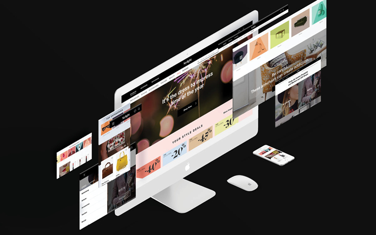
New navigation & homepageInteraction I Branding
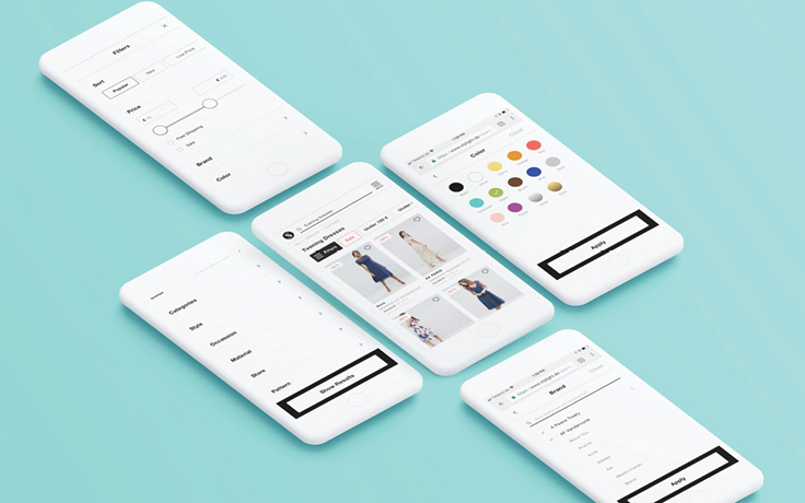
Filter UIInteraction I UI UX
Daho.am 2018Branding I Graphic Design I Interaction I Event
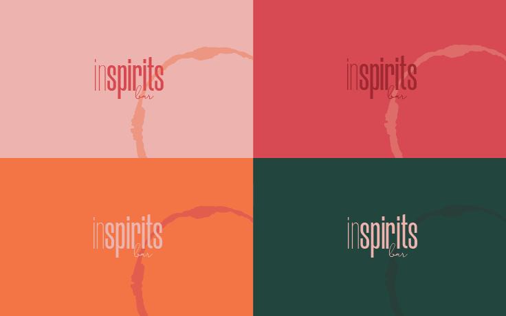
In Spirits BarBranding I Graphic Design I Interaction
Stylight BrandingBranding I Print I Graphic Design
Two Sides_ Posters of identityArt Direction I Photography I Self-iniciated
Packaging for a beauty setGraphic Design I Packaging
Design SystemUI UX
Magazine LayoutInteraction I UX UI
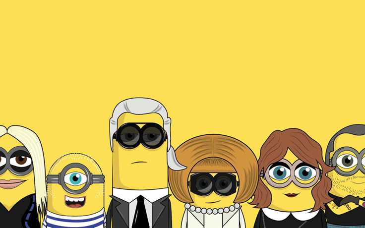
The MinionistasCampaign I Art Direction
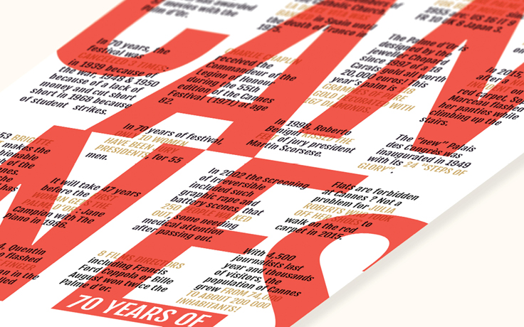
70 years of CannesTypography I Poster
Stylight AwardsEvent Branding I Website
Daho.am 2017Branding I Graphic Design I Interaction I Event
Genius ClubBranding I Event
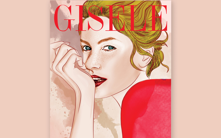
Gisele_ Her Life In CoversIllustration
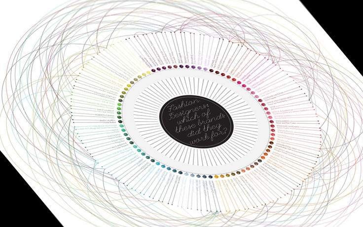
Fashion DesignersData Visualization
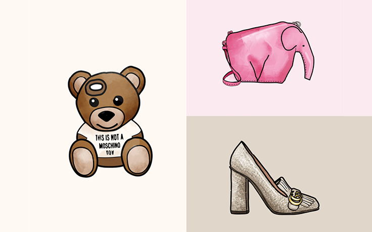
Iconic EyelinersIllustration
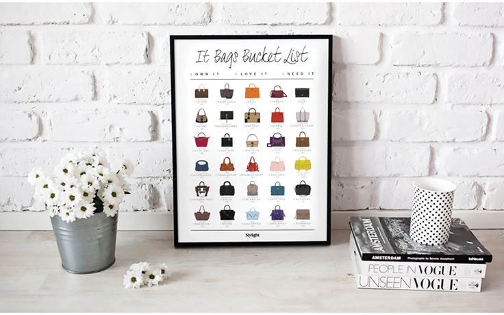
It Bags_ The bucket listIllustration I Poster Design
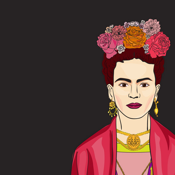
Frida KahloIllustration
Fashion Weeks_ Starter PacksIllustration I Campaign
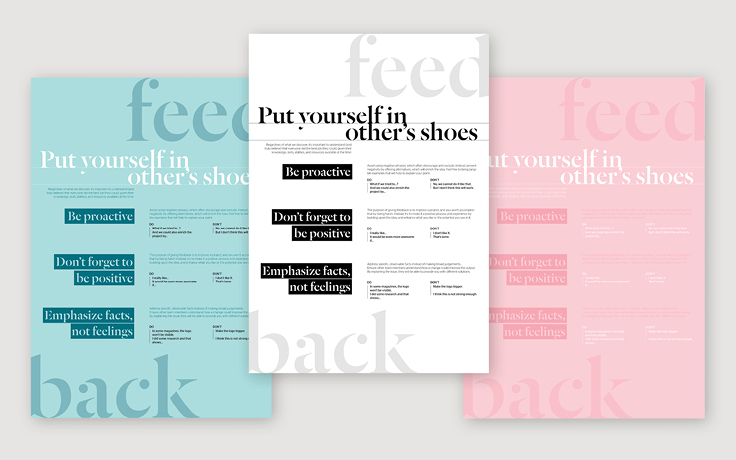
FeedbackGraphic Design
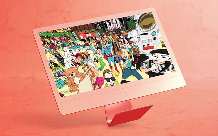
360 Map_ Celebrities in CoachellaArt Direction I Interaction
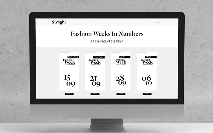
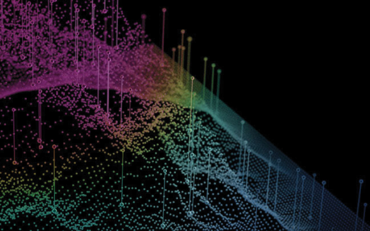
Fashion Weeks In NumbersGraphic Design I Interaction
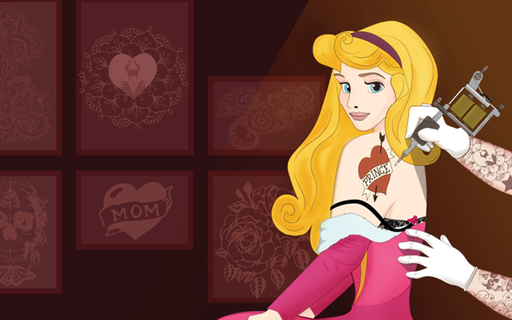
What do Disney Princesses do on Valentine's Day?Illustration I Campaign
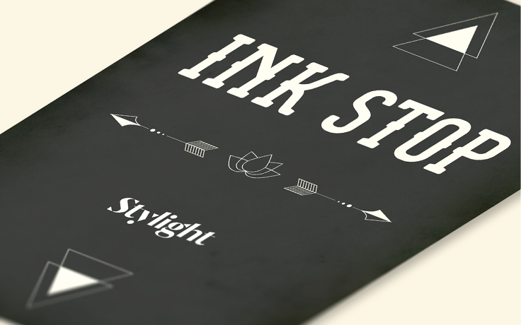
Ink StopBranding I Graphic Design
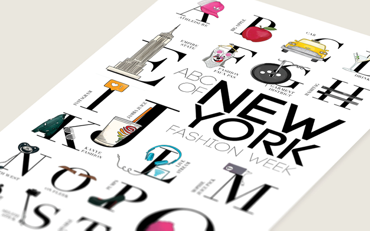
ABCs of Fashion WeeksGraphic Design I Interaction I Campaign
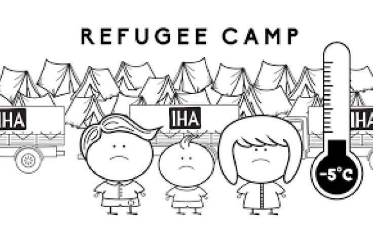
Intereuropean Human AidAnimation I Concept I Self iniciated
What is to grow upIllustration I Self-iniciated
Wall - DecorationArt Direction I Self-iniciated
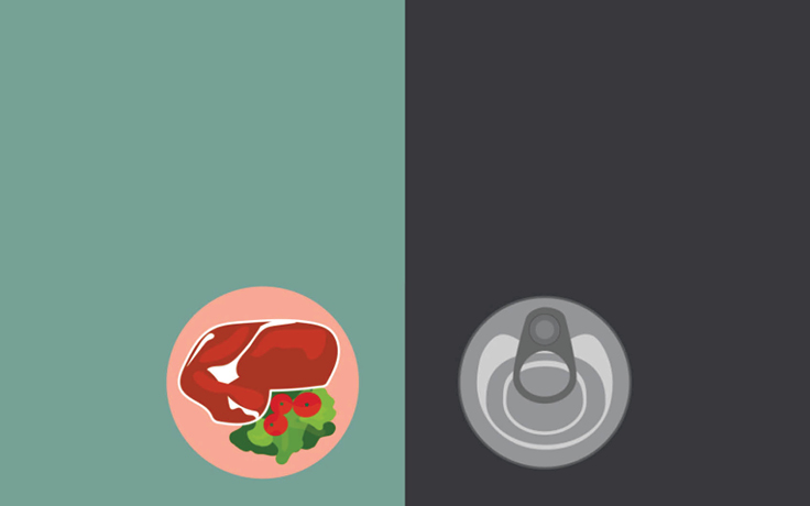
21 things you can buy for the same price as an Apple watchCampaign I Icon Design I Infographic
Women of SeriesIllustration